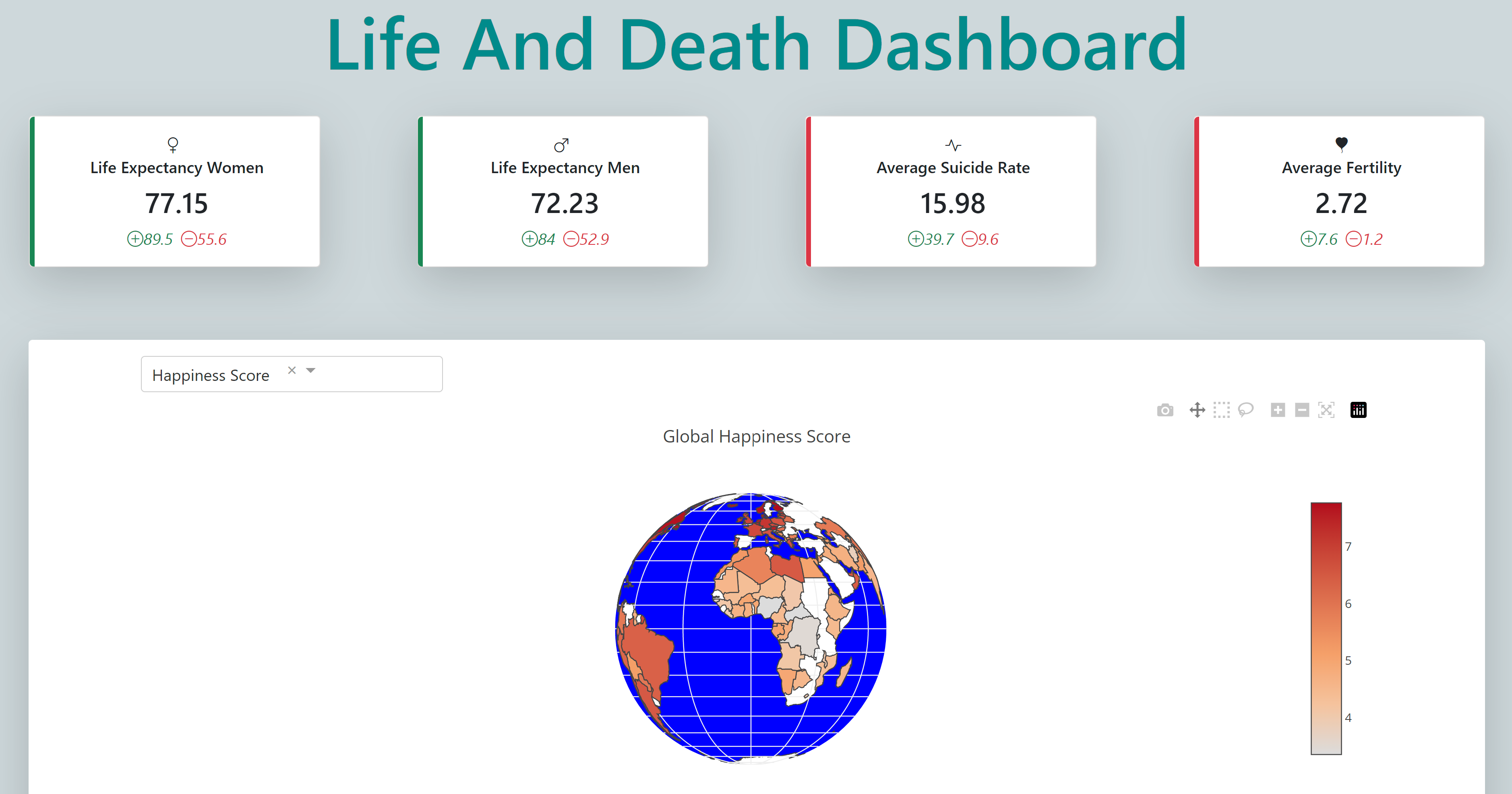
Visualizing Life and Death on a Global Scale: An Interactive Python Dashboard for Data Science
Motivation
My motivation for creating an interactive dashboard about life and death in the world using Python, Dash, and Plotly was fueled by a LinkedIn post by Thu Hien Vu that demonstrated the potential of Dash to create visually appealing interactive dashboards. As a lover of data visualization, I was drawn to the tool's flexibility and set out to explore it further.
Content
The dashboard features a header with the title 'Life and Death Dashboard', followed by 4 cards that highlight key figures for life expectancy for women, life expectancy for men, suicide rate, and fertility index. These maps reveal that life expectancy for women is generally higher than for men, and that the world's average fertility rate is above 2, indicating a rising population.
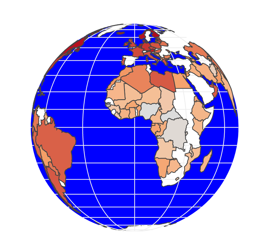
To delve deeper into the data, I created an interactive globe that allows users to see color-coded key indicators for each country, including life expectancy for men and women, happiness score, and fertility rate. The globe exposes significant disparities between countries and even within continents, and suggests correlations between the four indicators – countries with lower life expectancy rates tend to have lower happiness scores and higher fertility rates.
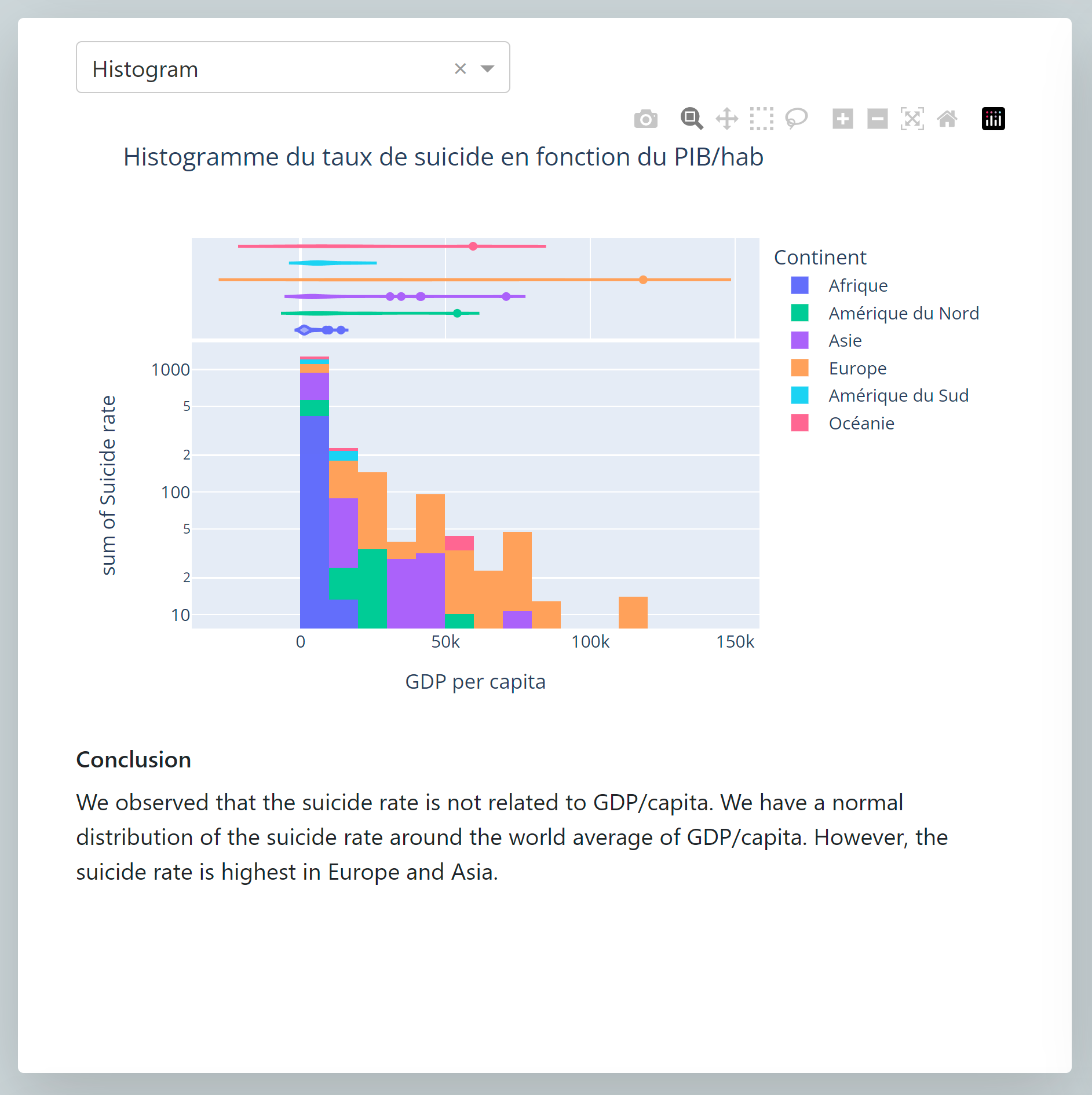
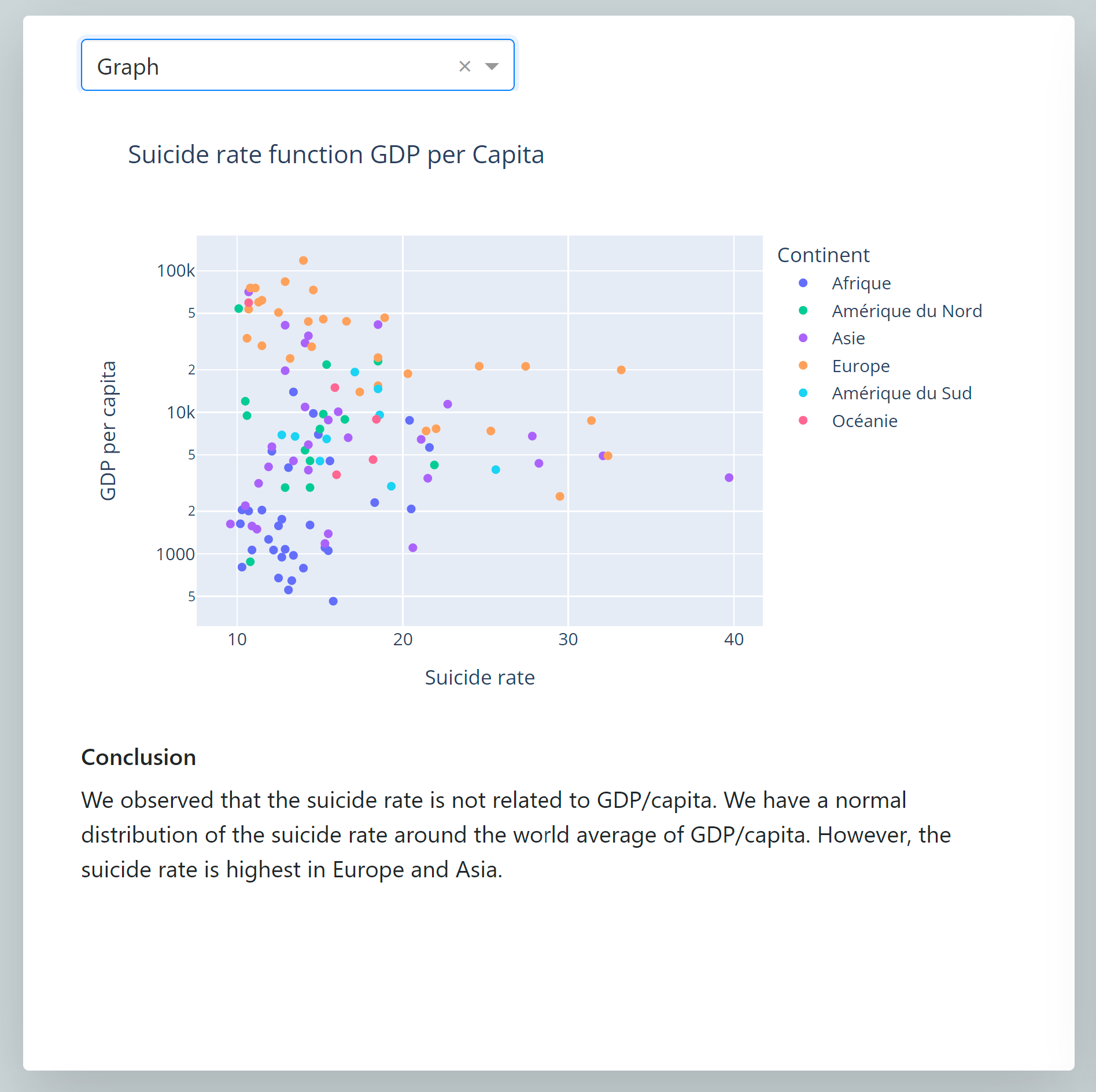
To further understand the trends in the dataset, I set up two dynamic graphs that allow users to select between scatter plots and histograms. The left graph examines the relationship between suicide rate and GDP per capita, but finds no link between the two. The right graph, on the other hand, reveals a strong correlation between happiness score and life expectancy, and also shows that fertility rate is correlated to happiness score – countries with higher fertility rates tend to have lower happiness scores.
Then I wanted to look at the relationship between happiness index and life expectancy. Are the happiest people the ones who live the longest? Actually there appears to be a strong correlation between the happiness index and life expectancy. Moreover, we notice that the fertility rate (depending on the size of the circles) is correlated to the happiness index. The higher the fertility rate, the lower the happiness index and vice versa. 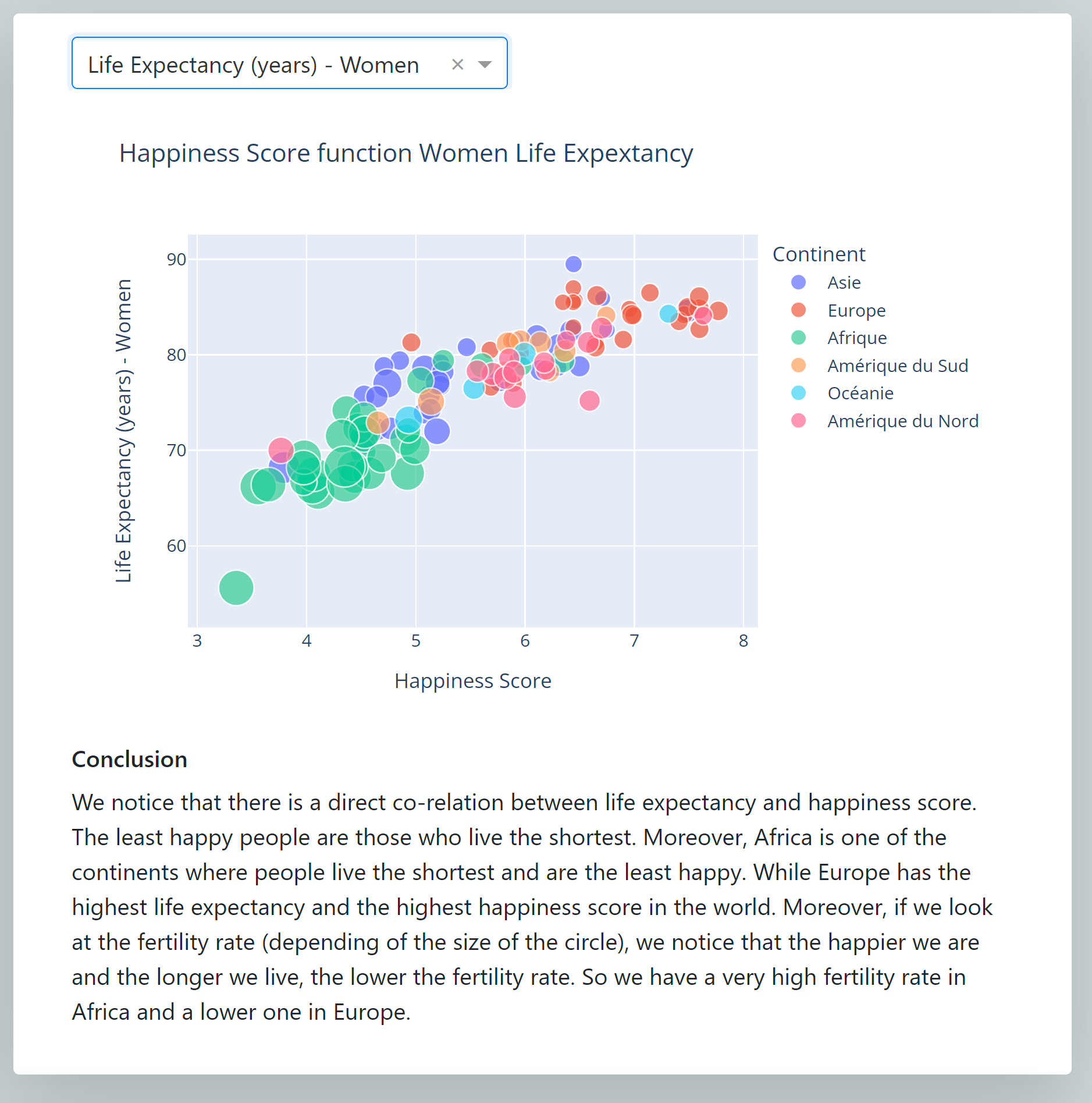
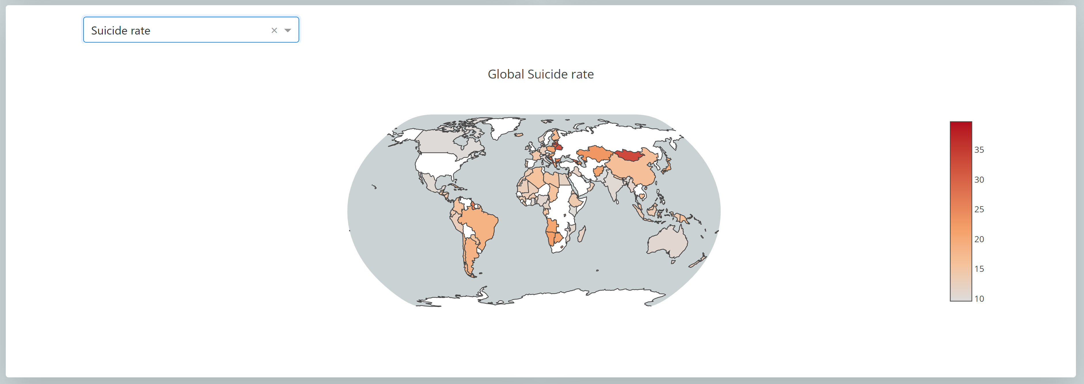
I also created a map using a 'natural earth' projection that displays a wider range of criteria, including suicide rate and GDP per capita. This map allows for a more detailed examination of the relationships between these variables.
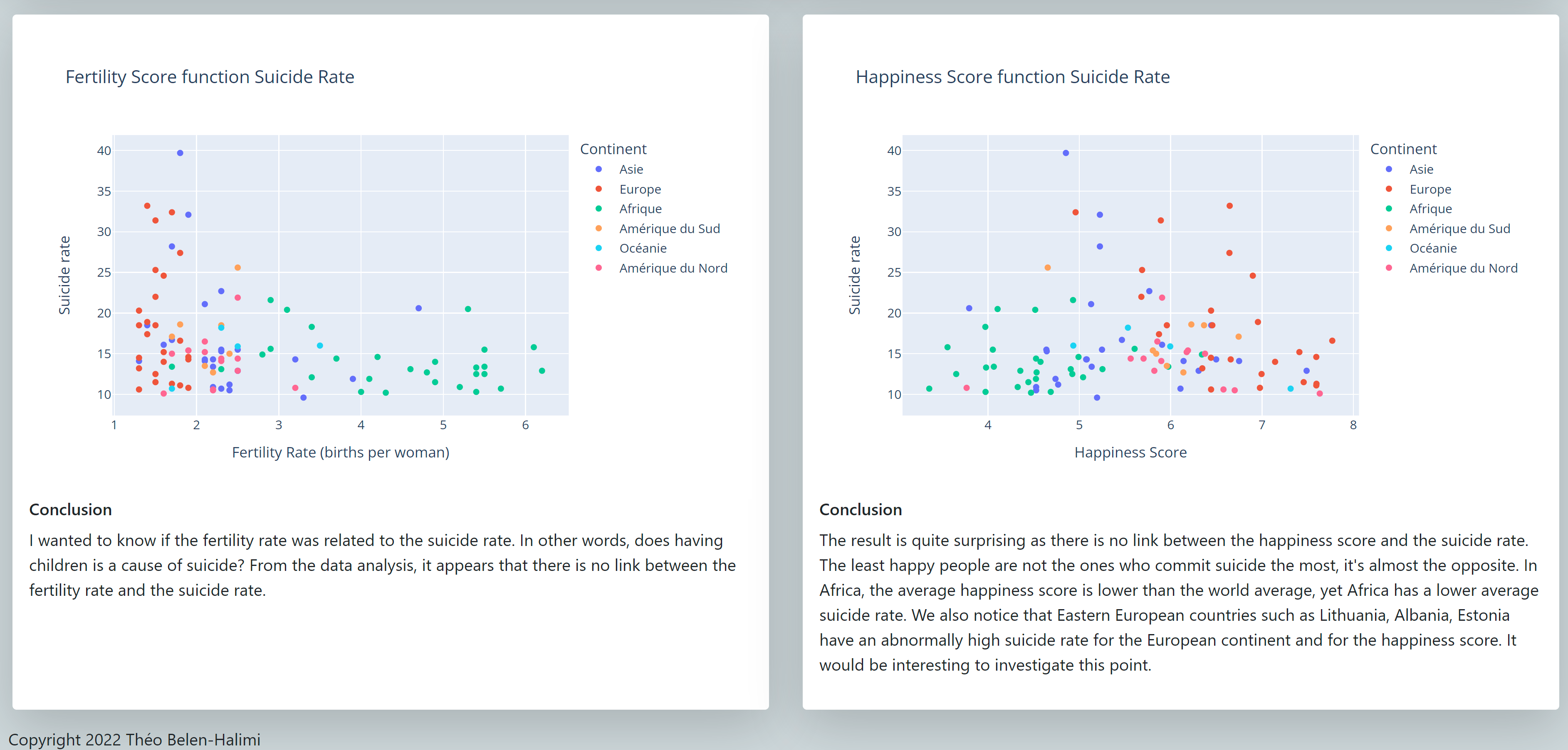
Finally, I attempted to answer two main questions: Is having children a cause of suicide? And are the unhappiest people most likely to commit suicide? The results of my study suggest that there is no link between fertility rate and suicide rate, and that it is actually the happiest people who are more likely to commit suicide.
Conclusion
Overall, this study has allowed me to showcase various correlations between different factors such as suicide rate and happiness index. These insights would not have been possible without data analysis and visualization. I thoroughly enjoyed creating the interactive globe and map, which enabled me to effectively represent and explore the data.