Exploring the CO2 Emission with an Interactive Python Dashboard using Panel/hvplot
Content
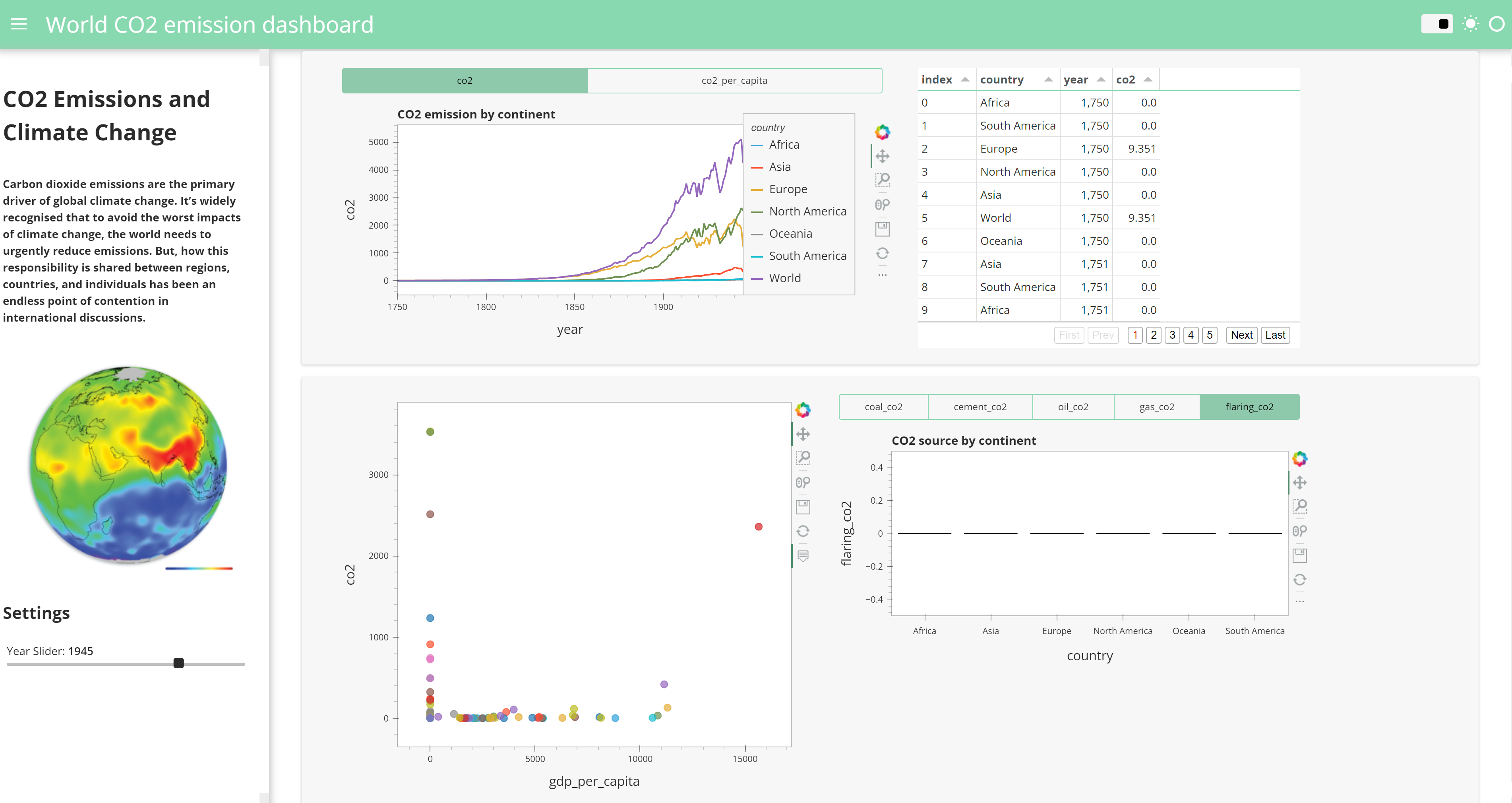
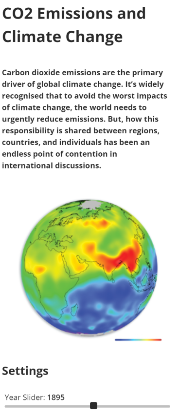
My dashboard includes a sidebar that provides context for the study and allows users to parameterize the entire dashboard using a time slider. The slider adjusts the dashboard according to the selected year.
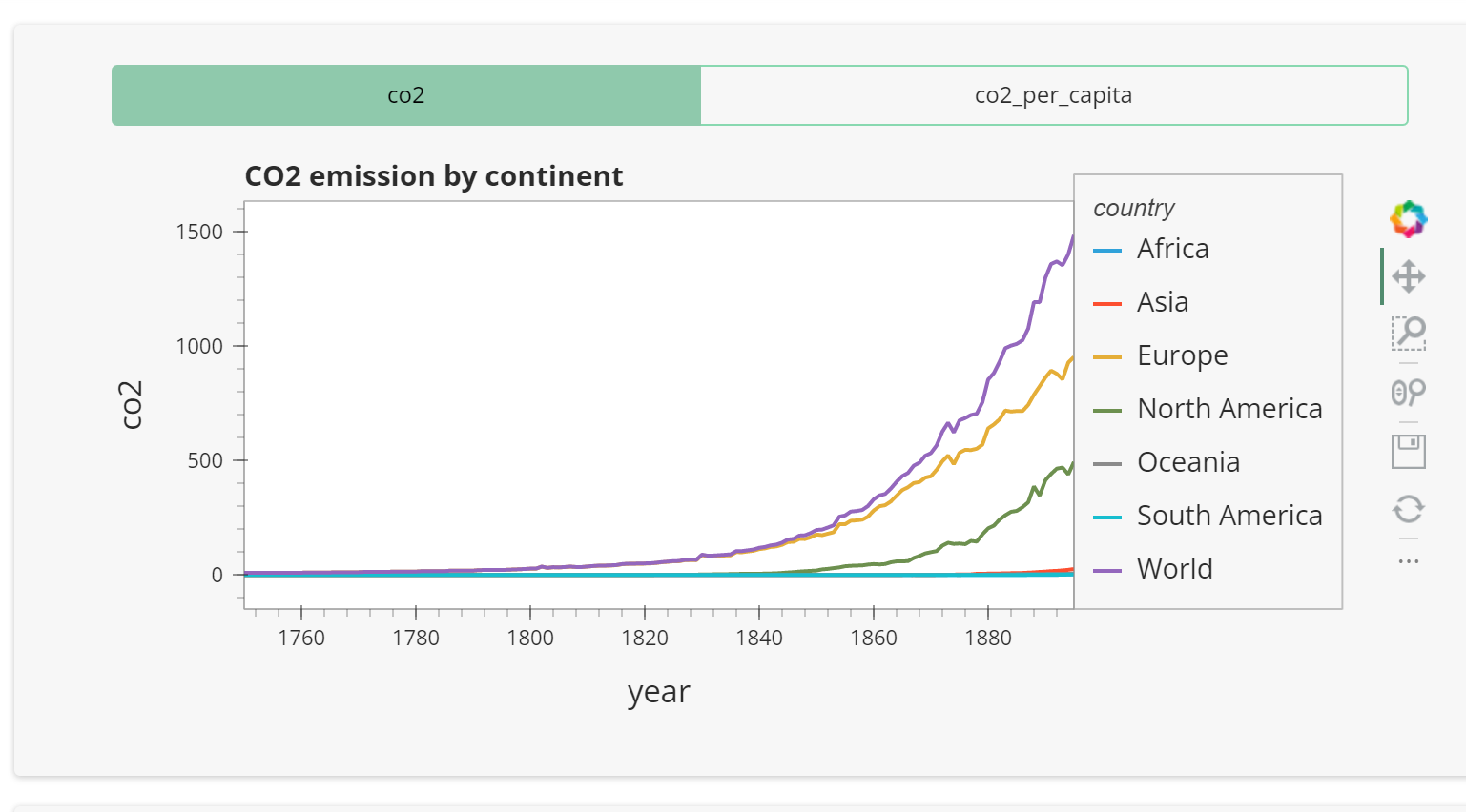
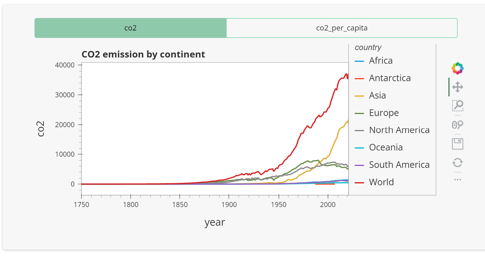
One of the standout features of my dashboard is a graph that illustrates CO2 emissions and CO2 emissions per inhabitant across different continents and years (modifiable with the slider). The graph shows that CO2 emissions have only grown exponentially since 1750.
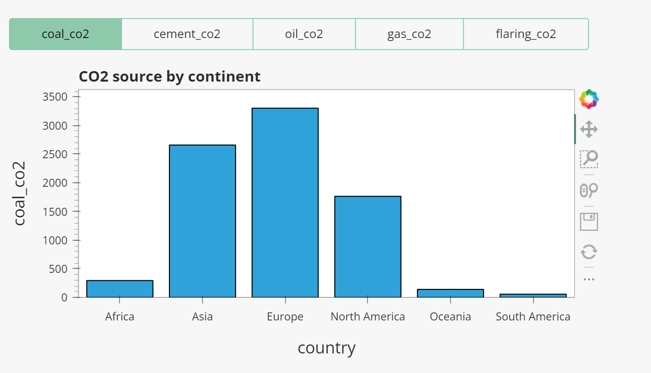
I also created a more detailed graph that shows the sum of CO2 emissions by continent, broken down by source (oil, gas, cement, flaring, coal), and by year (changeable with the slider). This graph reveals that emissions have increased by at least a factor of 10 between 1900 and 2021, and highlights the growing role of Asia as the most emitting continent on the planet.
Conclusion
In conclusion, my data visualization work on CO2 emissions has brought to light the dominance of industrialized and developed countries in terms of emissions, with the United States, China, and the European Union leading the way. It also shows the steady increase in emissions over time, reflecting the constant demand for energy and fossil fuels. Through this project, I have been able to enhance my data visualization skills and gain a deeper understanding of libraries like Panel and hvplot, allowing me to choose the most suitable options for presenting data.